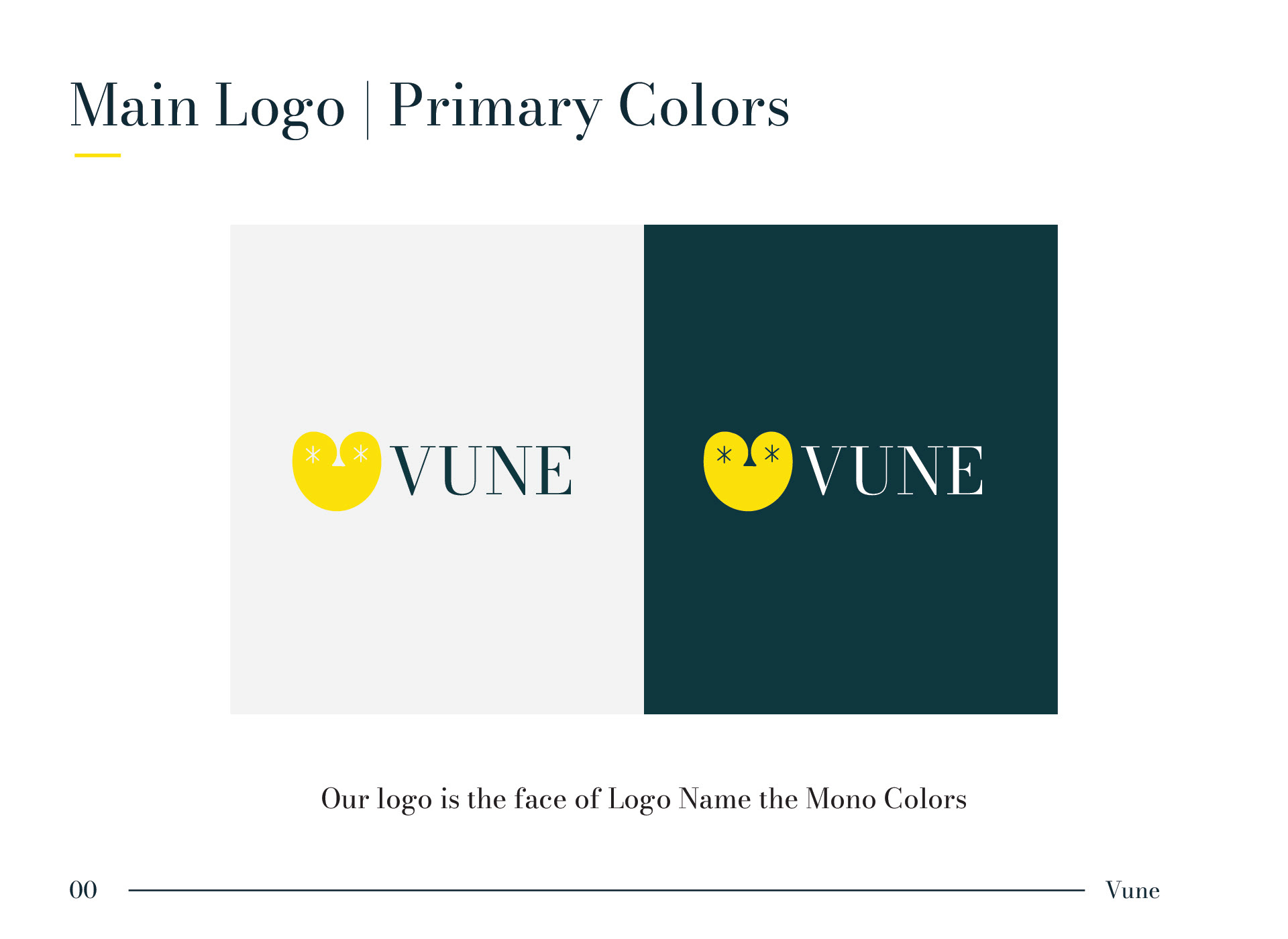
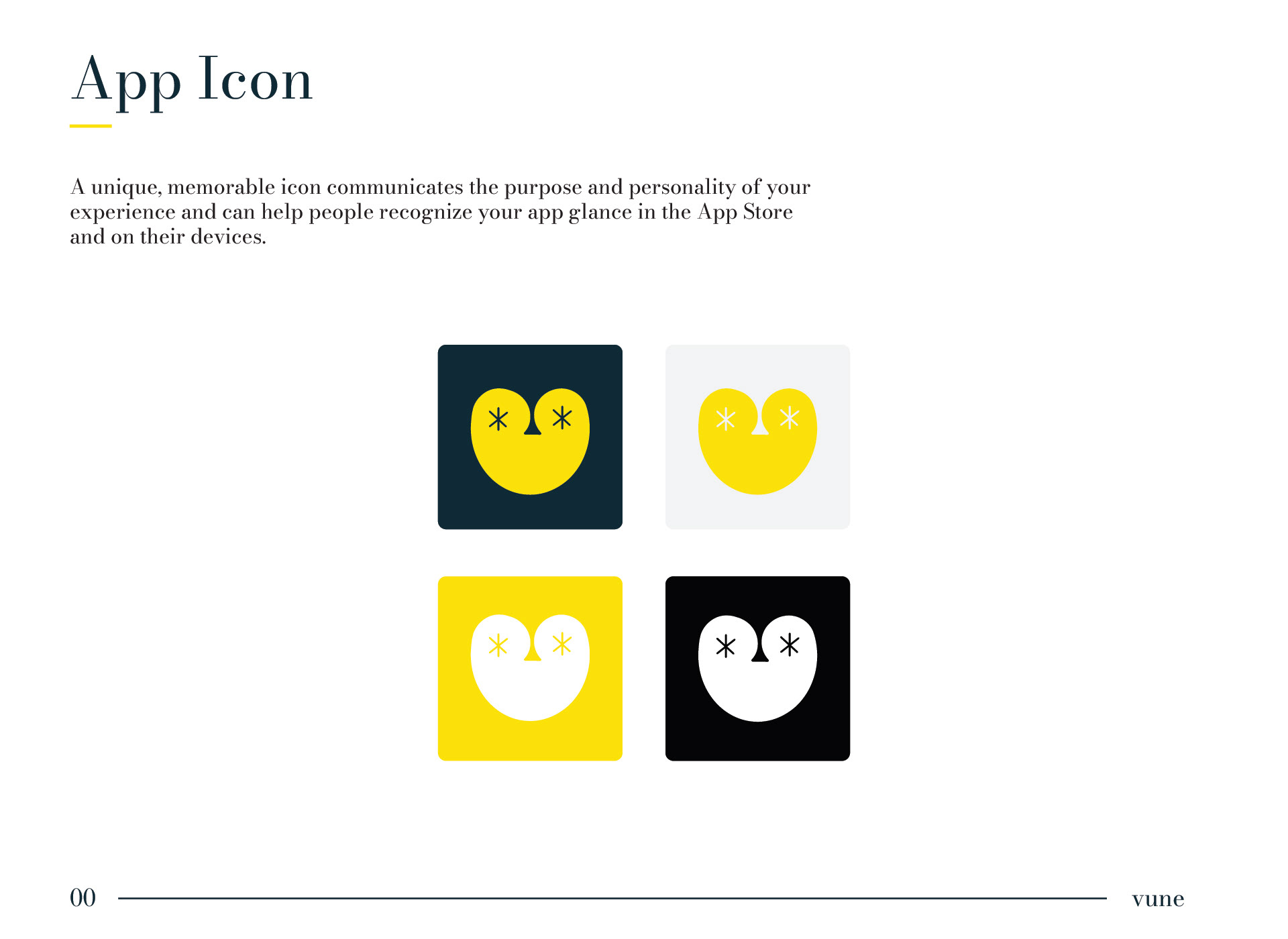
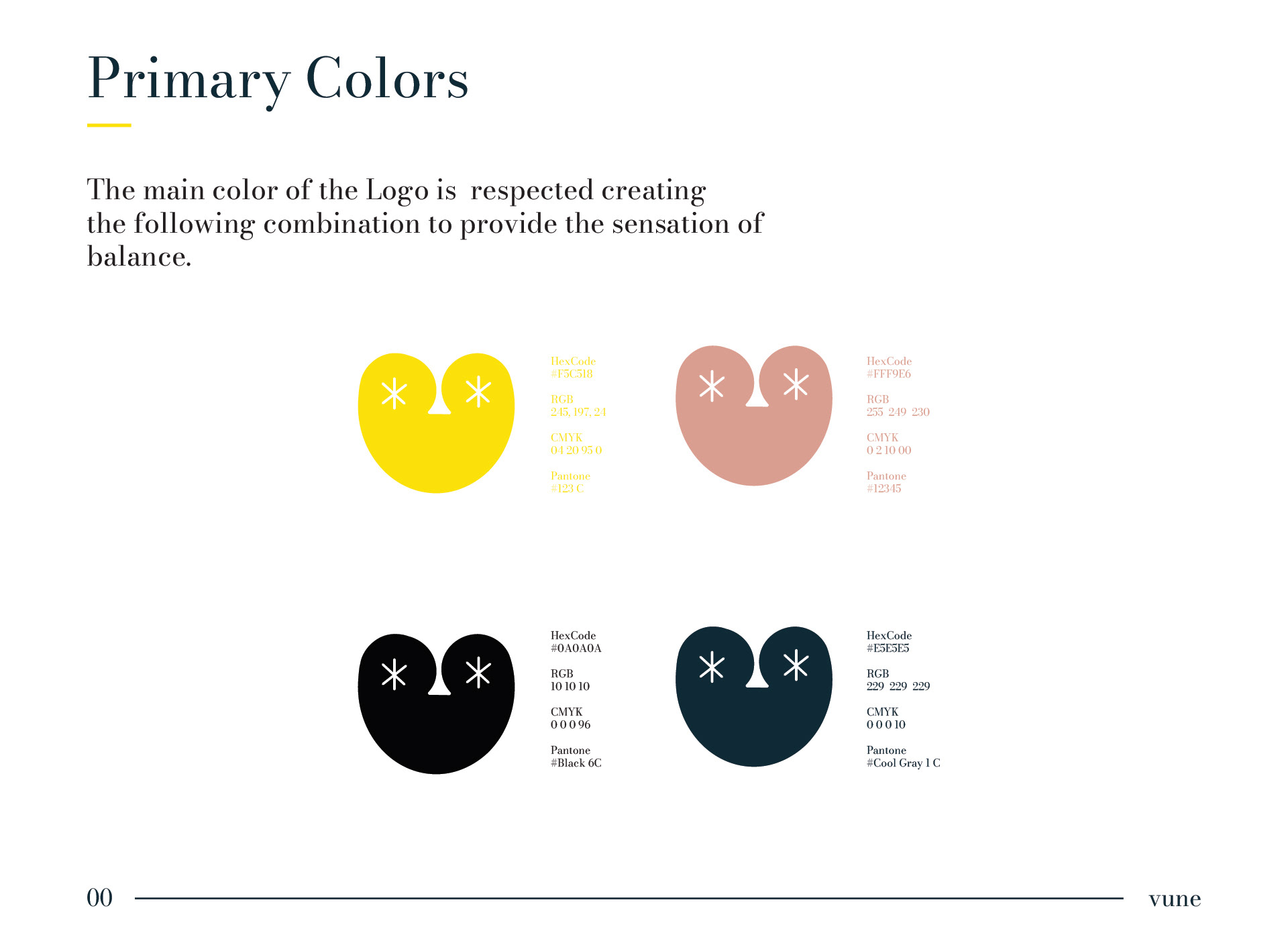
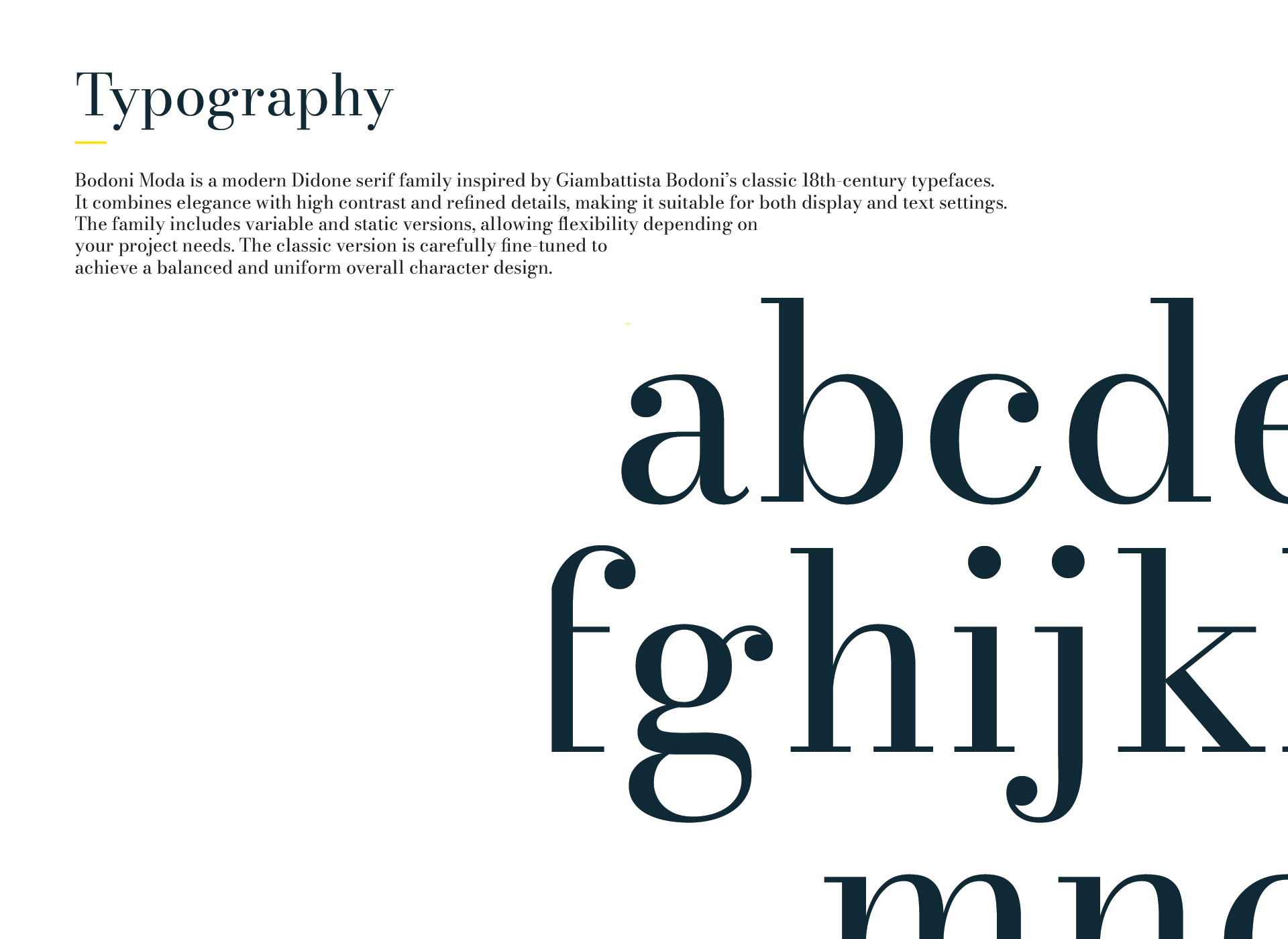
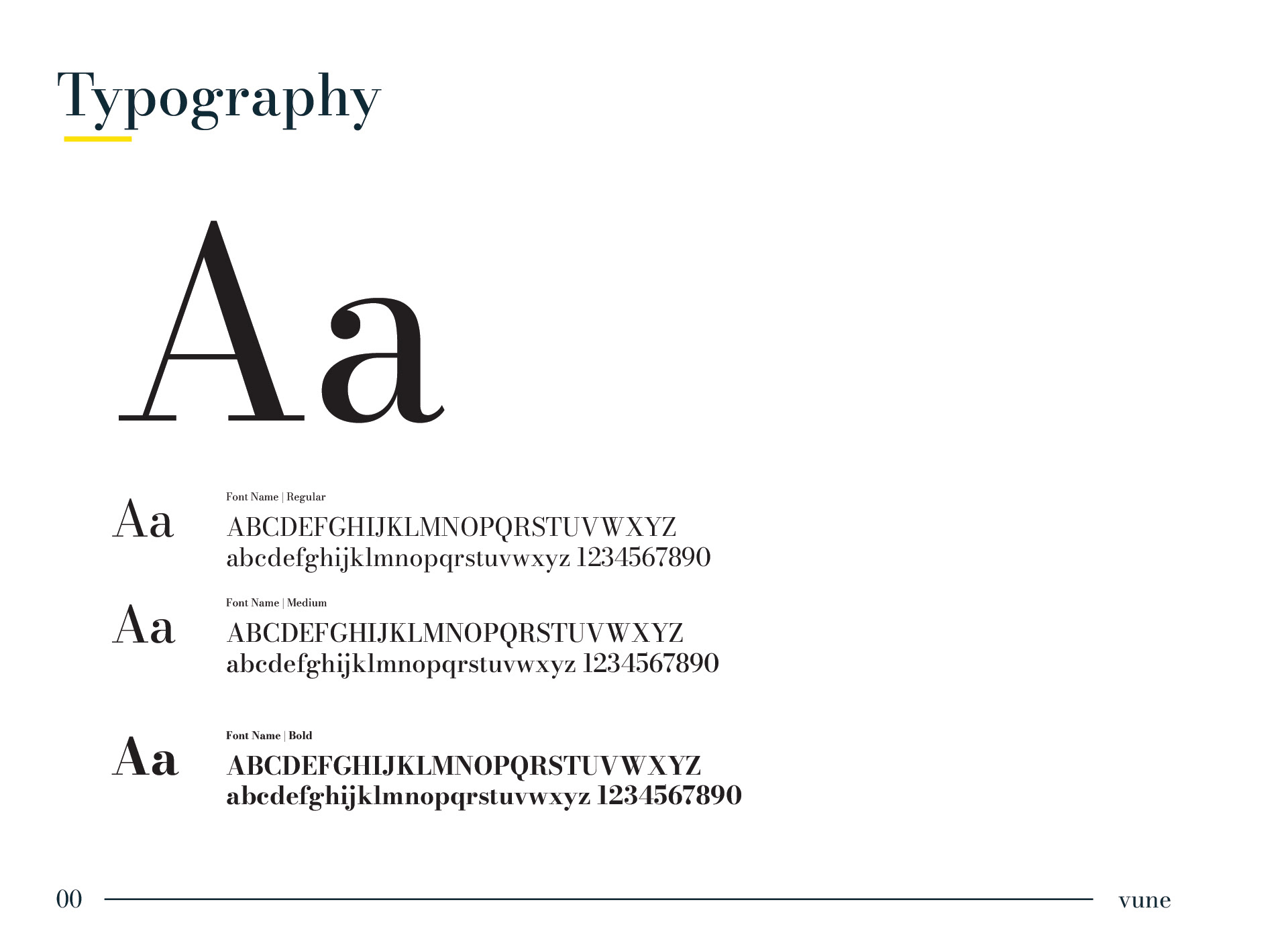

Project Overview
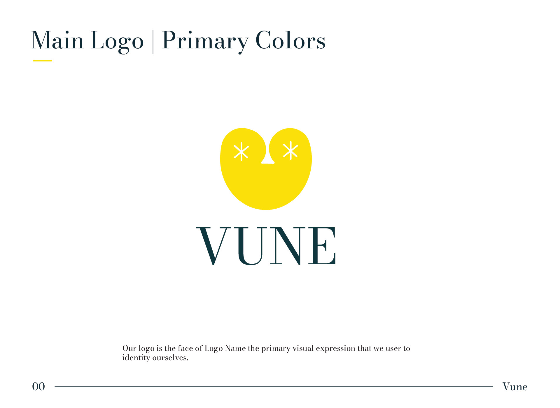
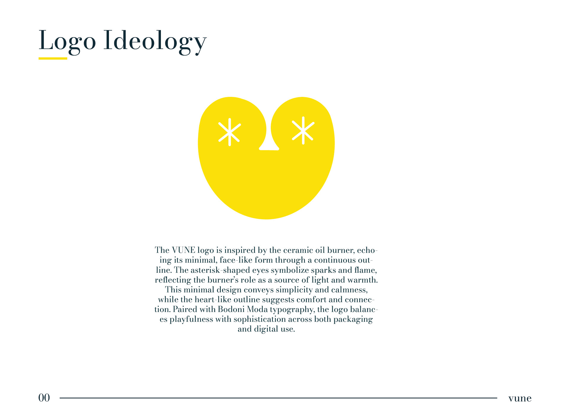
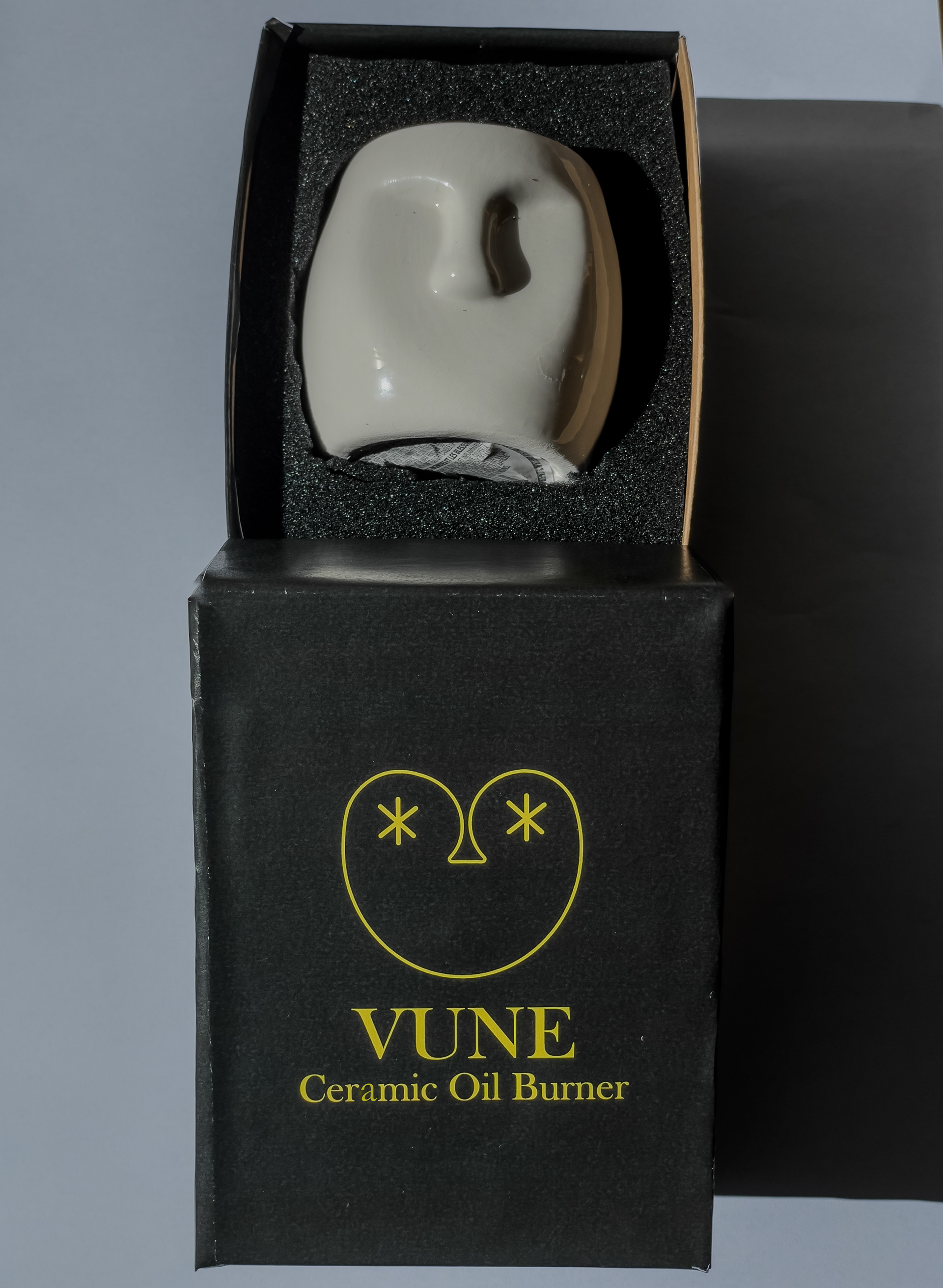
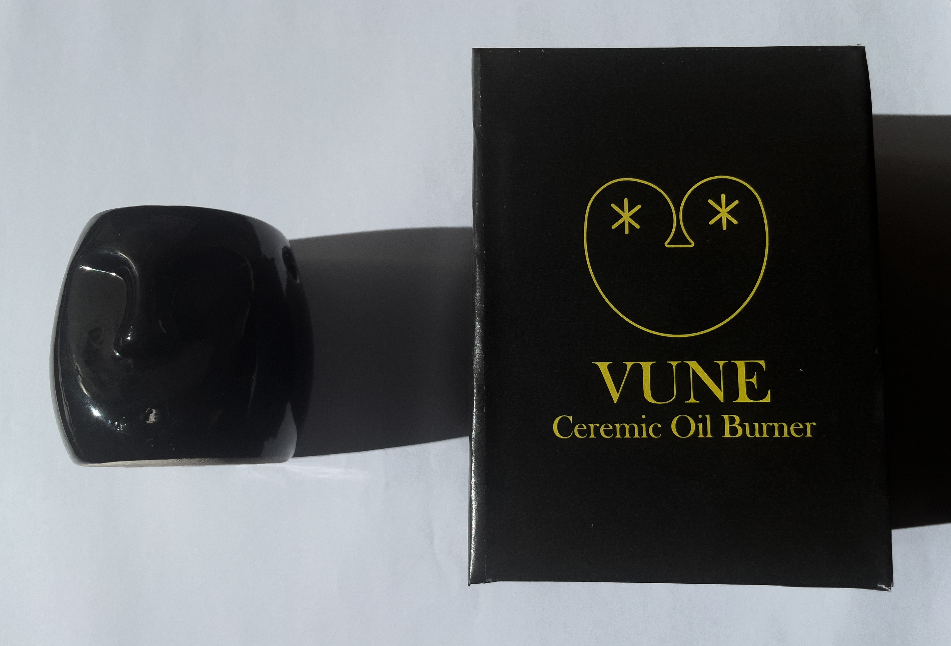
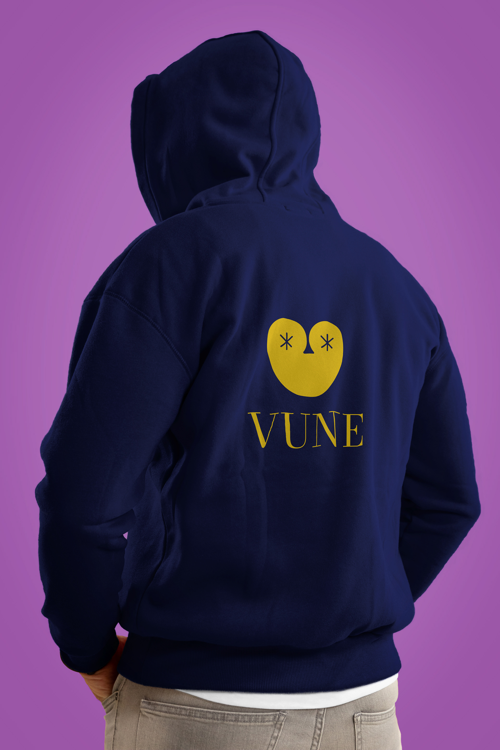
This project was created as part of a class assignment where we were asked to pick any item from Dollar Tree and either create a new brand or rebrand it. I chose a ceramic oil burner as my product.
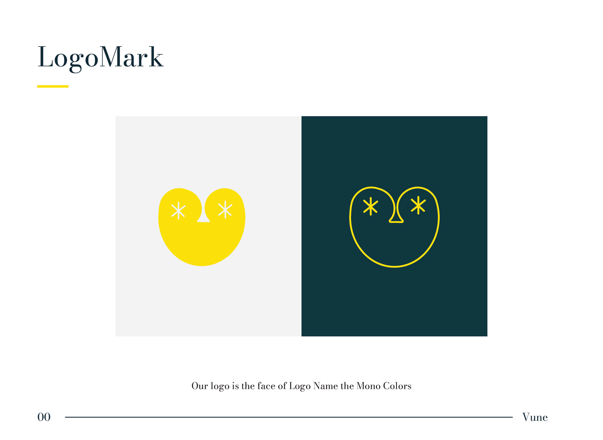
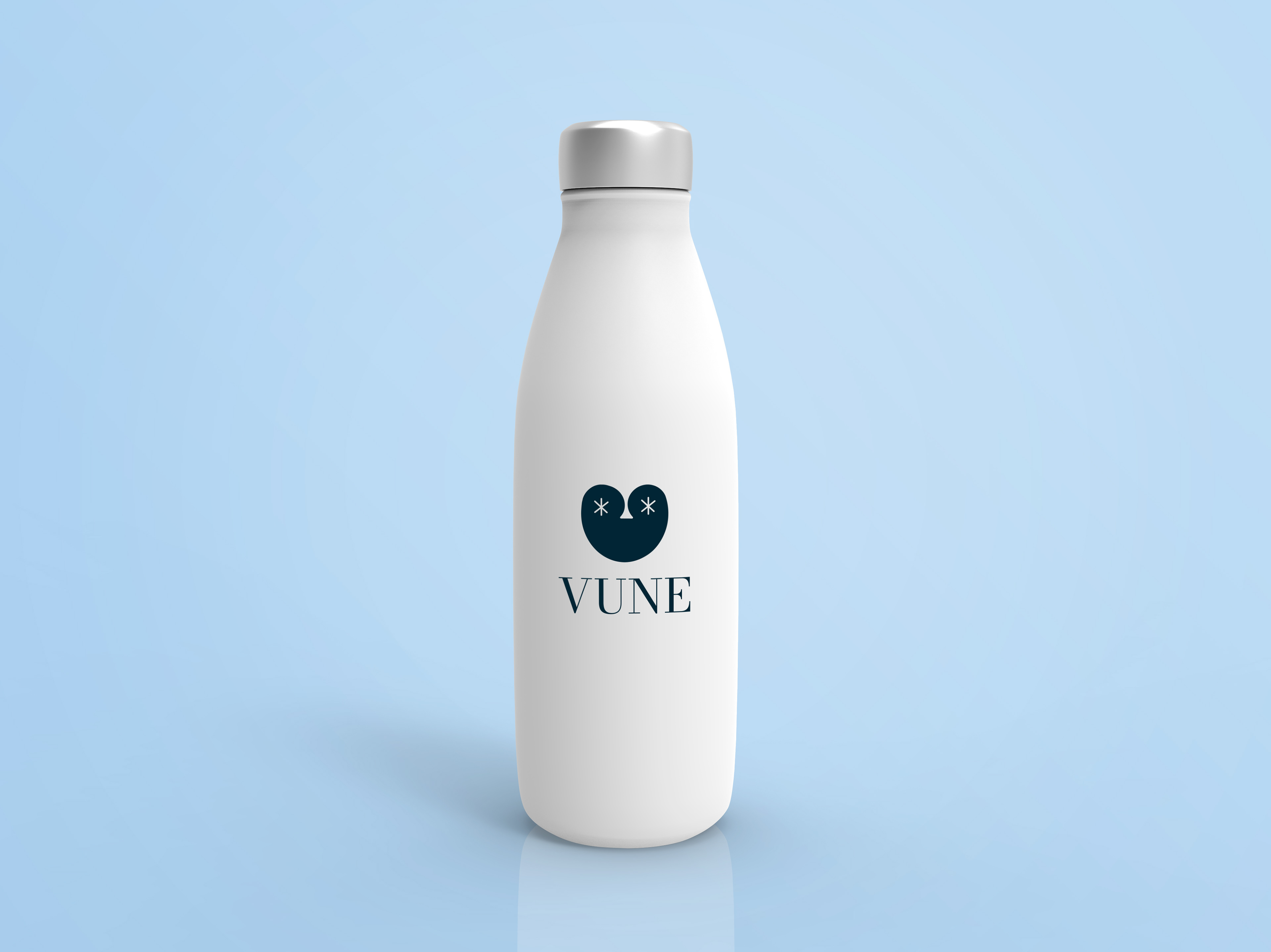
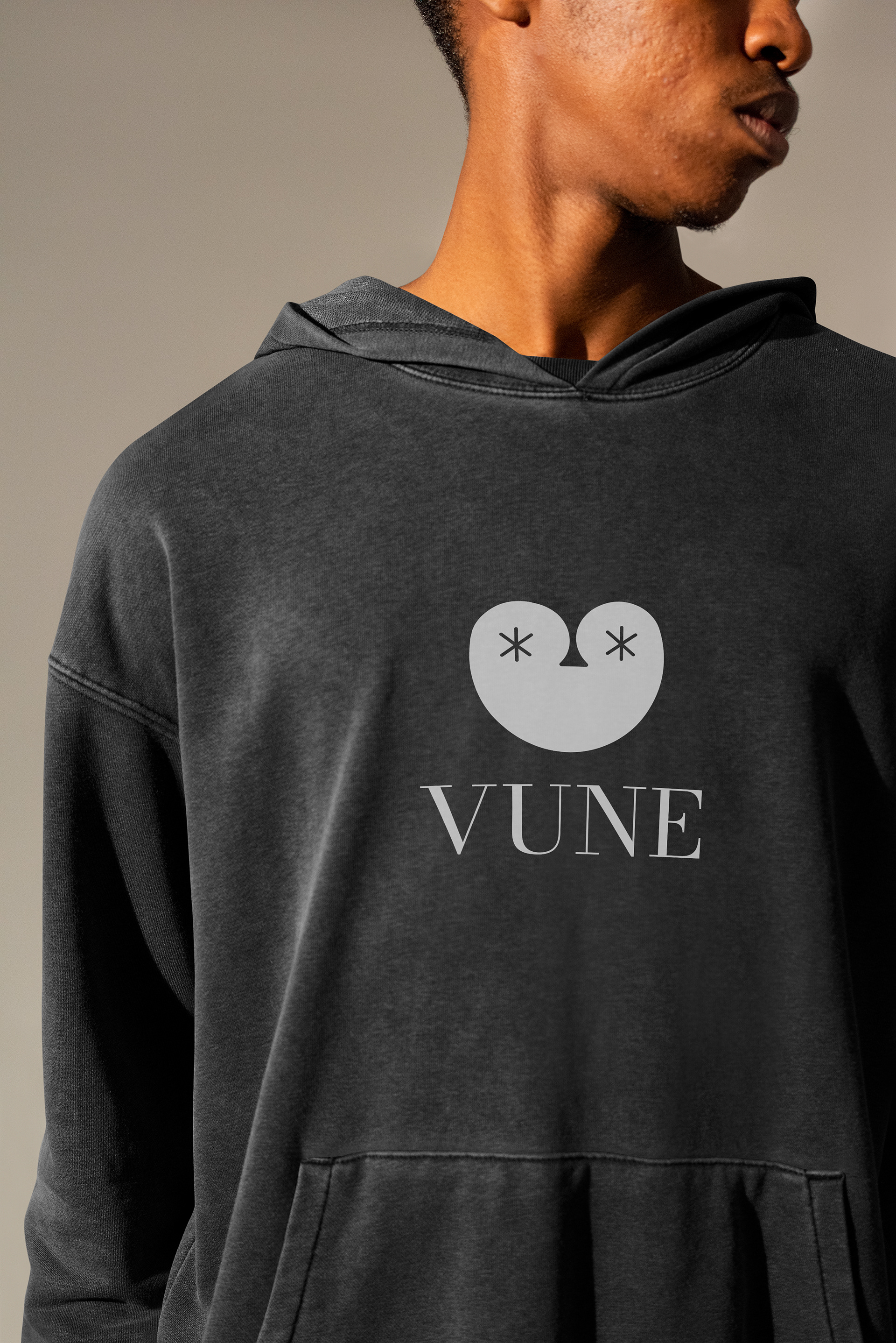
The challenge was not only to design a brand identity but to make the logo feel like the product itself simple, recognizable, and connected to the form and purpose of the burner. I focused on translating the burner’s minimal, face-like shape into a logo that could be instantly identifiable, while still working across packaging, digital applications, and brand materials.
The hardest part of the process was finding a balance between abstract design and product familiarity making sure the logo was clean and modern but still clearly tied to the oil burner’s character and function.