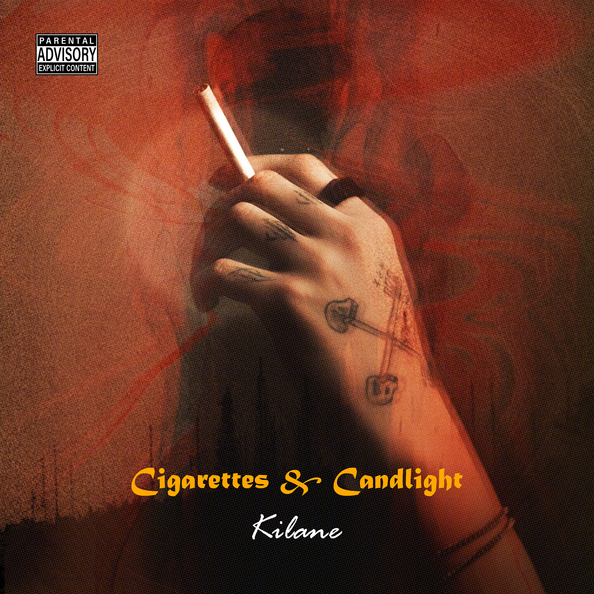
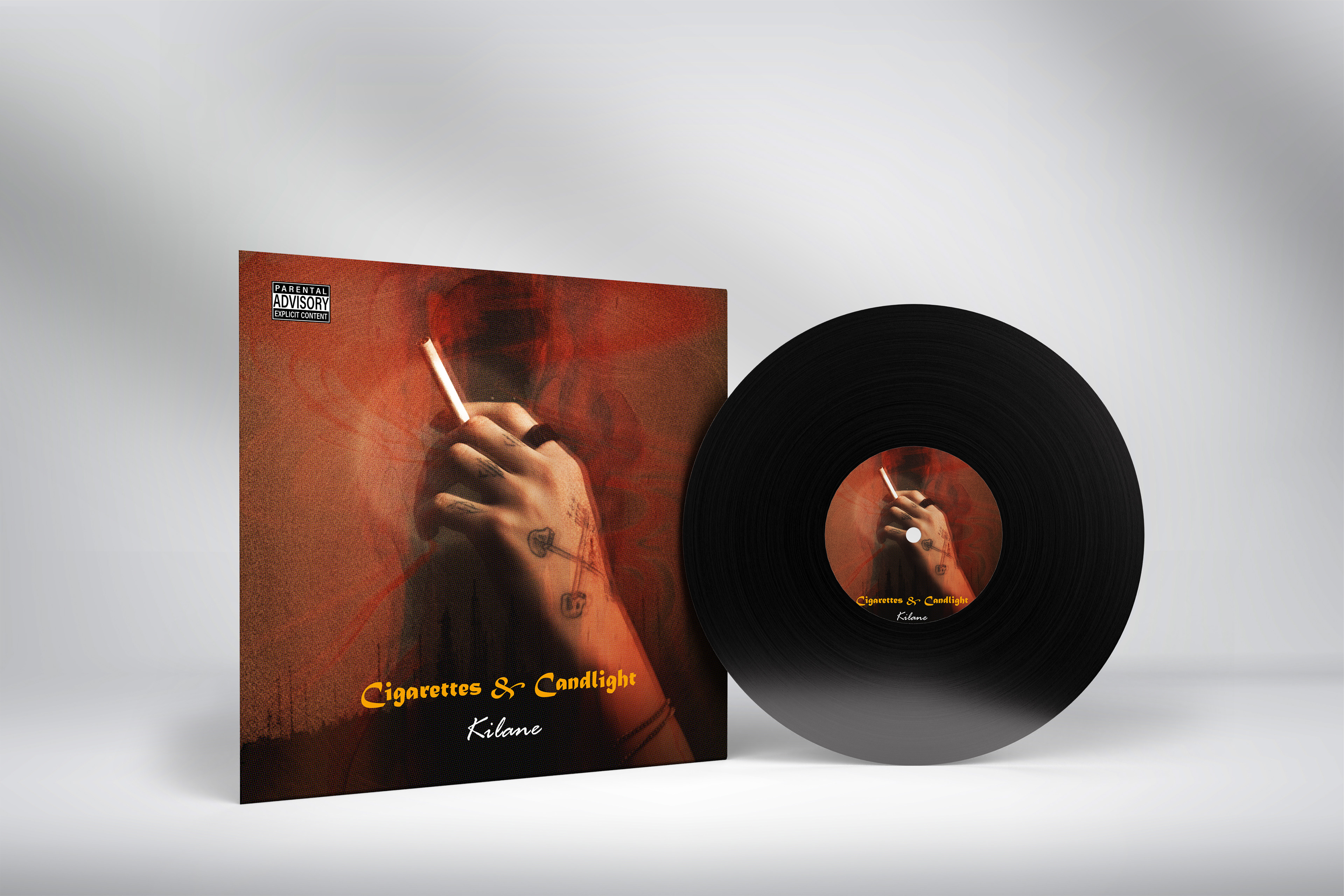
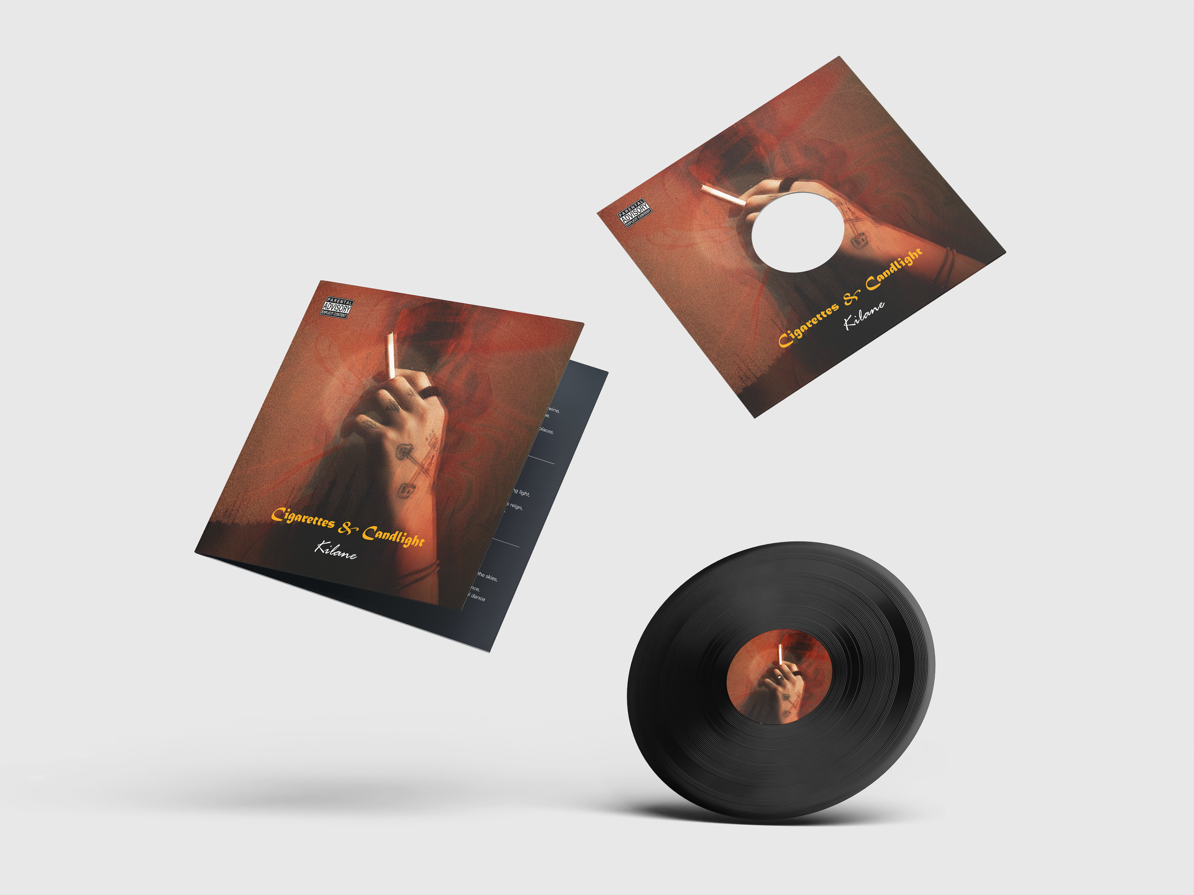
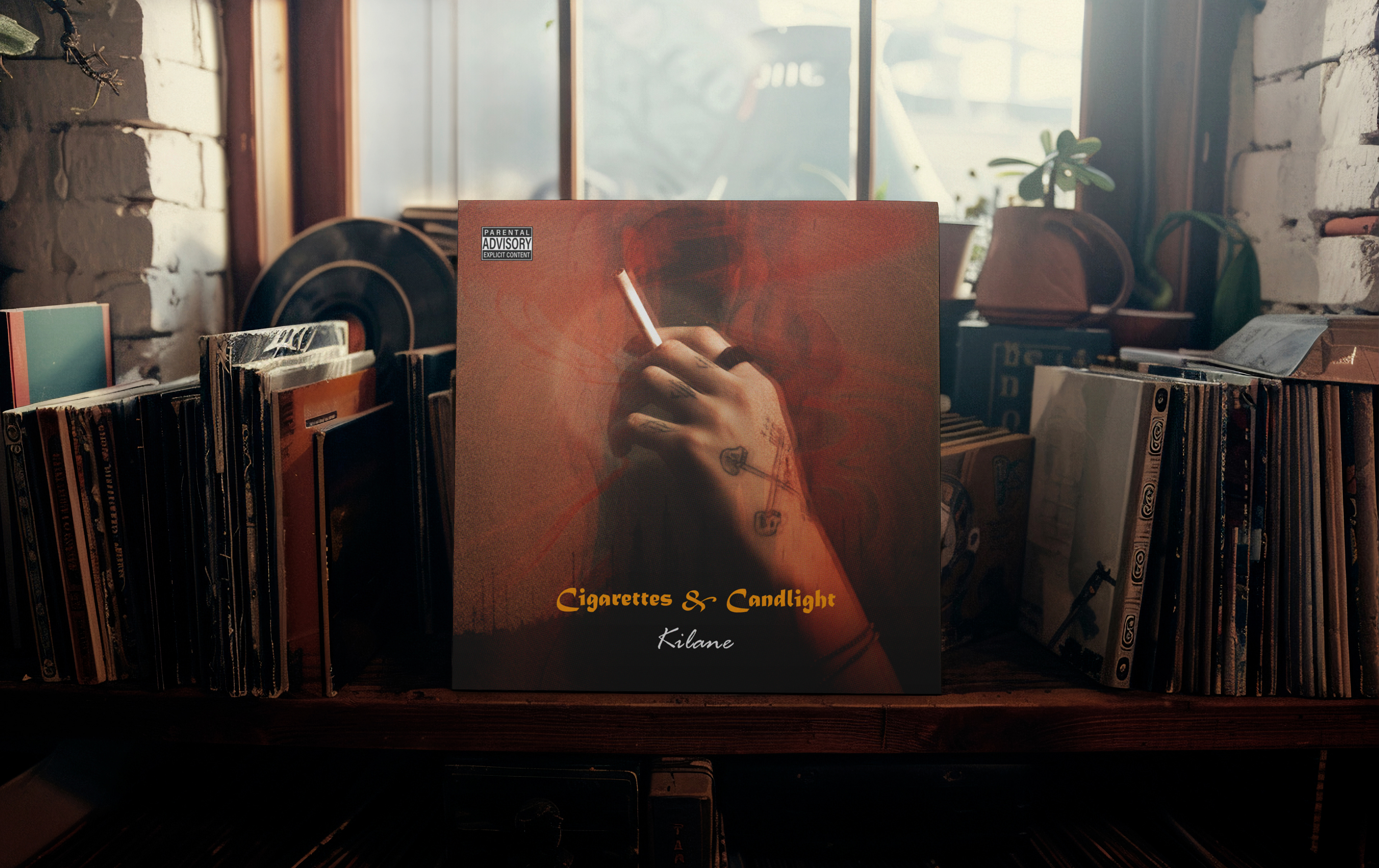
A cinematic album cover design that captures the warmth, nostalgia, and solitude behind Cigarettes & Candlelight a project exploring the beauty of quiet moments and emotional honesty.
The Story
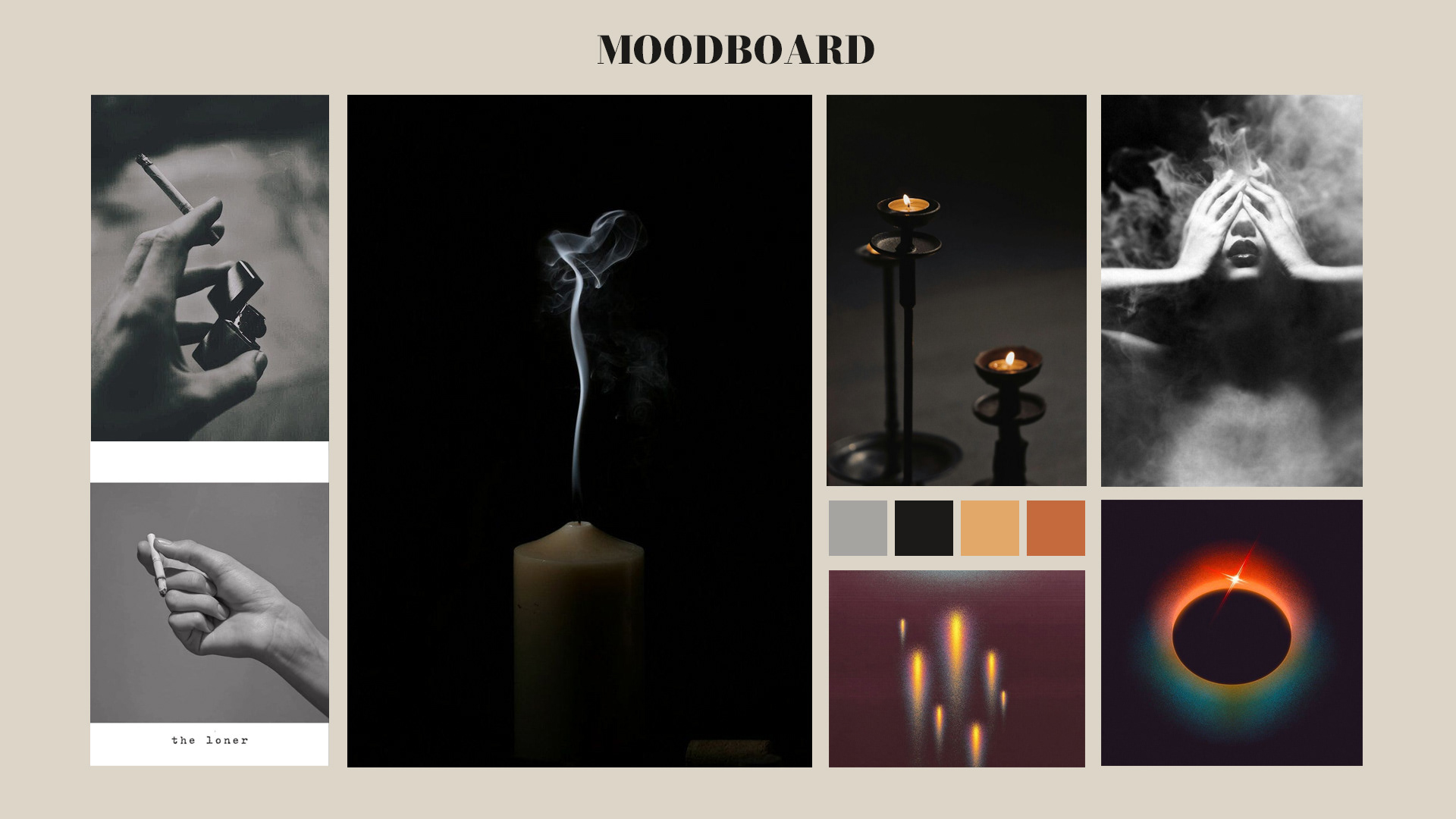
Cigarettes & Candlelight began as a quiet idea a moment between habit and reflection. The artist, Kilane, wanted a cover that felt deeply emotional yet visually simple. Something that looks like a memory, not a photo a blend of smoke, warmth, and solitude.
He described the mood as “moody, nostalgic, but calm like a late-night conversation lit only by a candle.”
My goal was to bring that emotion to life through color, light, and texture.
Client’s Goals:
Create a moody, cinematic atmosphere that feels real, not overly polished.
Use warm lighting to represent intimacy and comfort.
Capture the dual meaning of the title Cigarettes (habit, chaos) and Candlelight (warmth, peace).
Design something emotional enough to stand alone as art.
Kilane’s request:
“I want people to feel like they’ve been there like the photo holds a story.”
Design Process
Step 1 – Composition
Focused on a single hand holding a cigarette, framed closely to create connection and intimacy. The gesture feels real and human.
Step 2 – Lighting & Color Grading
Warm amber and deep red tones mimic candlelight — soft but heavy with emotion. Shadows add depth and mystery.
Step 3 – Smoke Layering
Blended multiple smoke textures and Gaussian blur to make the smoke feel alive — not edited, but breathing in the scene.
Step 4 – Typography
Cigarettes & Candlelight uses a vintage serif to feel timeless and cinematic.
Kilane is handwritten to feel personal, like signing a letter.
Step 5 – Final Touches
Grain, vignette, and film texture gave the final image an analog realism — like an old photo rediscovered.

The final design captures stillness and warmth a moment of quiet emotion. The light feels fragile, the smoke alive, and the story open to interpretation.
This project taught me how to tell stories with atmosphere instead of words. Cigarettes & Candlelight reminded me that design isn’t always about clarity sometimes it’s about leaving space for emotion.
Every decision, from tone to typography, was about creating something that feels human imperfect, warm, and real.