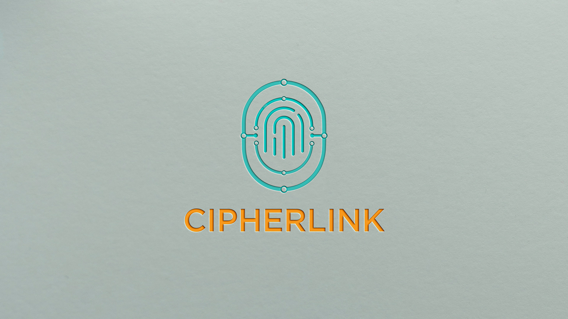
This project was developed as part of a class assignment on brand-identity design. The brief was to create a complete brand system and logo for a new company concept. I chose Cipher Link, a cybersecurity brand that focuses on trust, protection, and digital connectivity. The challenge was to design a unique yet simple mark that clearly communicates security and connection while feeling modern, minimal, and professional.
Logo Concept
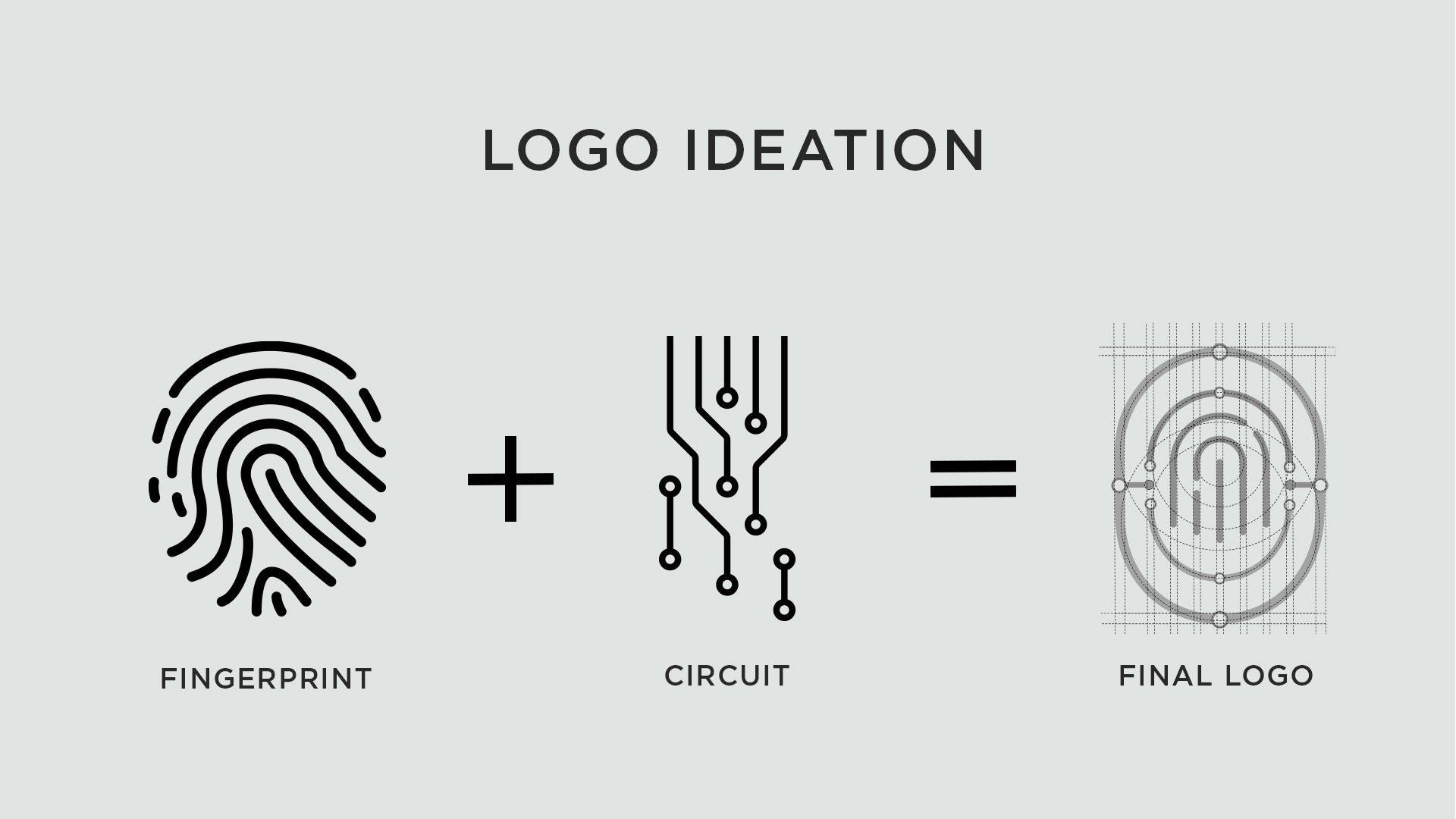
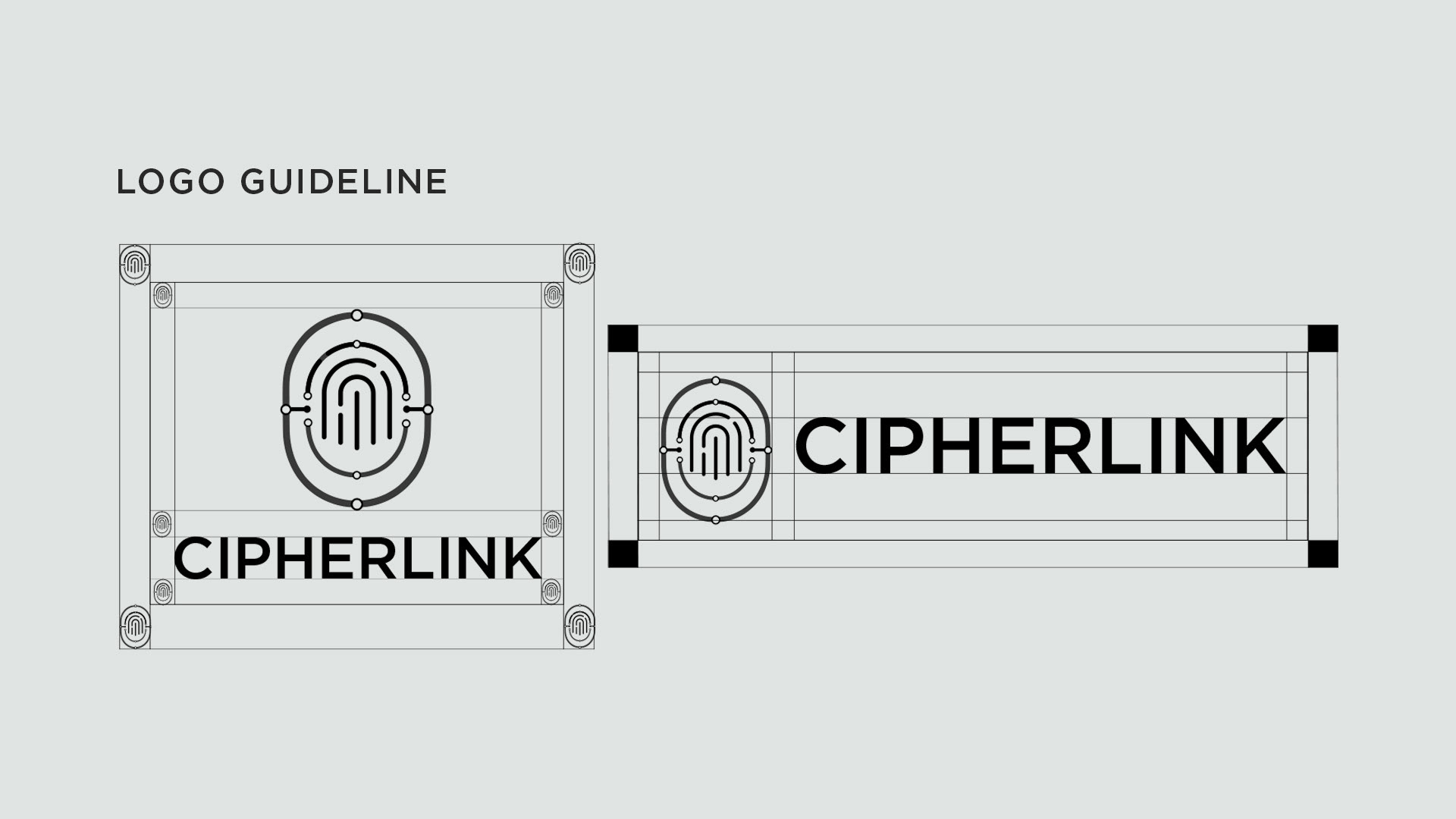
The logo is inspired by the fusion of a fingerprint and a circuit, symbolizing the link between human identity and digital security. The fingerprint expresses trust, authentication, and individuality, while the circuit lines stand for technology, data protection, and seamless communication.
Together they form a unified mark that represents Cipher Link’s mission protecting digital connections and ensuring safe interaction between people and technology. The mix of organic fingerprint curves and precise circuit geometry balances humanity with innovation, producing a design that is clean, scalable, and instantly recognizable.
Design Process
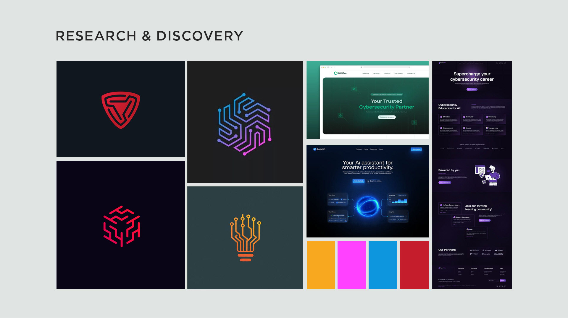
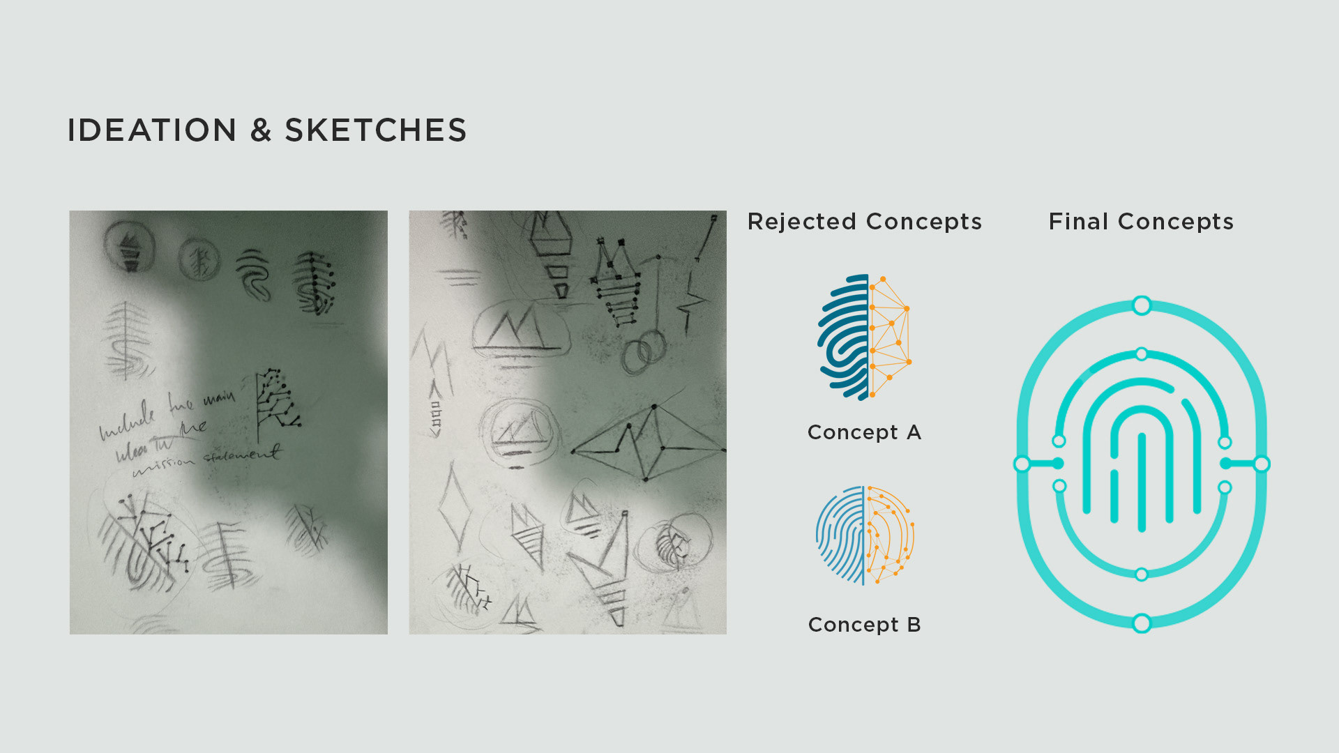
The process began with sketching multiple directions, exploring shapes that combined biometric patterns with electronic pathways. Many early sketches were complex, so simplification became essential. I then digitized the best concepts in Adobe Illustrator, refining line weights, spacing, and symmetry until the design felt cohesive.
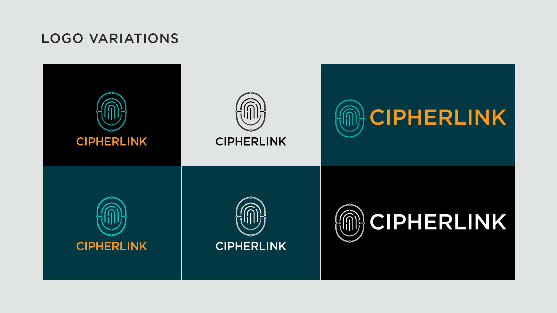
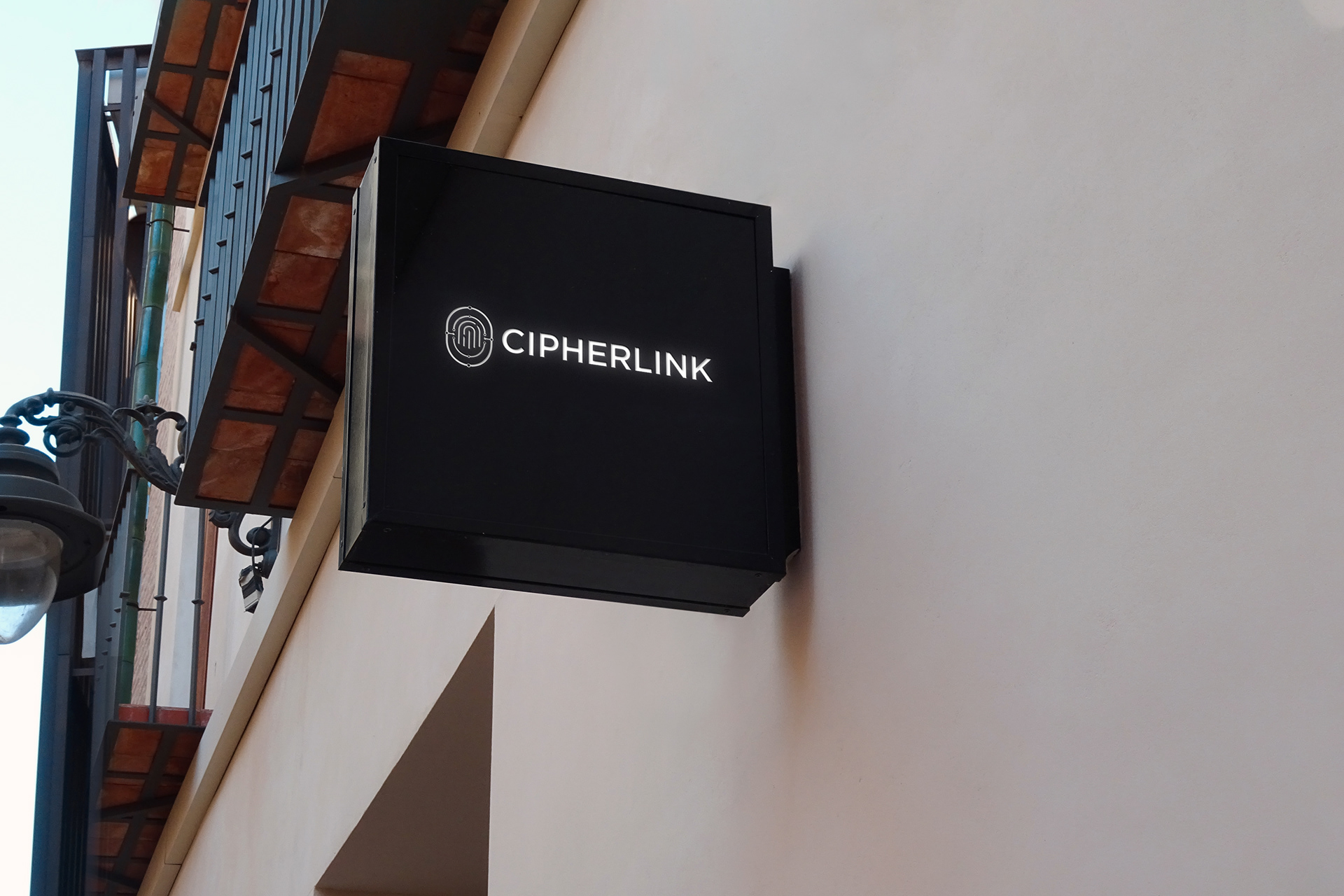
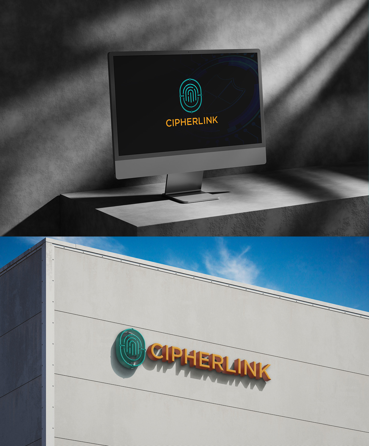
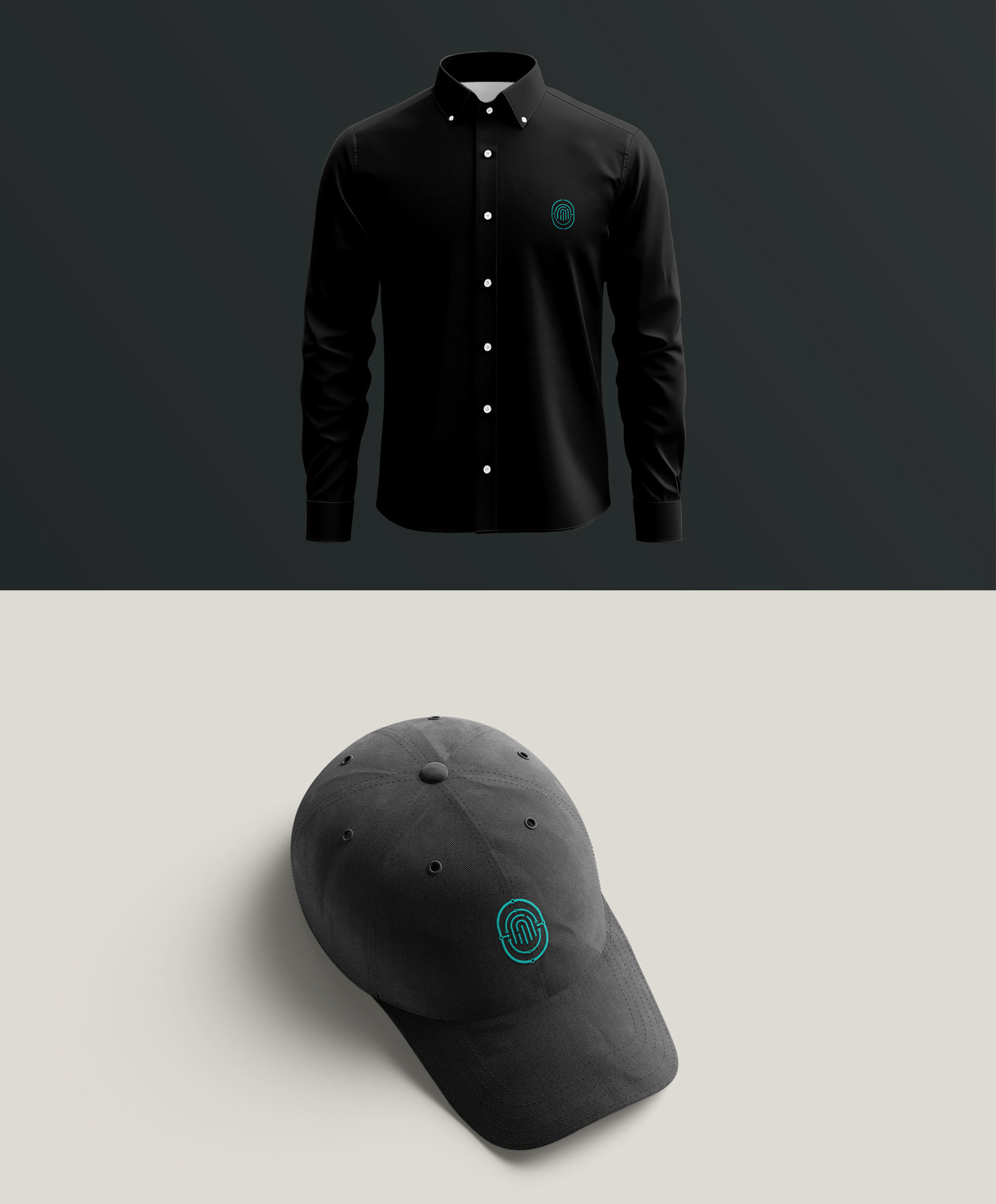
Afterward, I built mockups to test visibility and proportion across different contexts such as dark and light backgrounds, app icons, and stationery.
Afterward, I built mockups to test visibility and proportion across different contexts such as dark and light backgrounds, app icons, and stationery.
Problems & Challenges
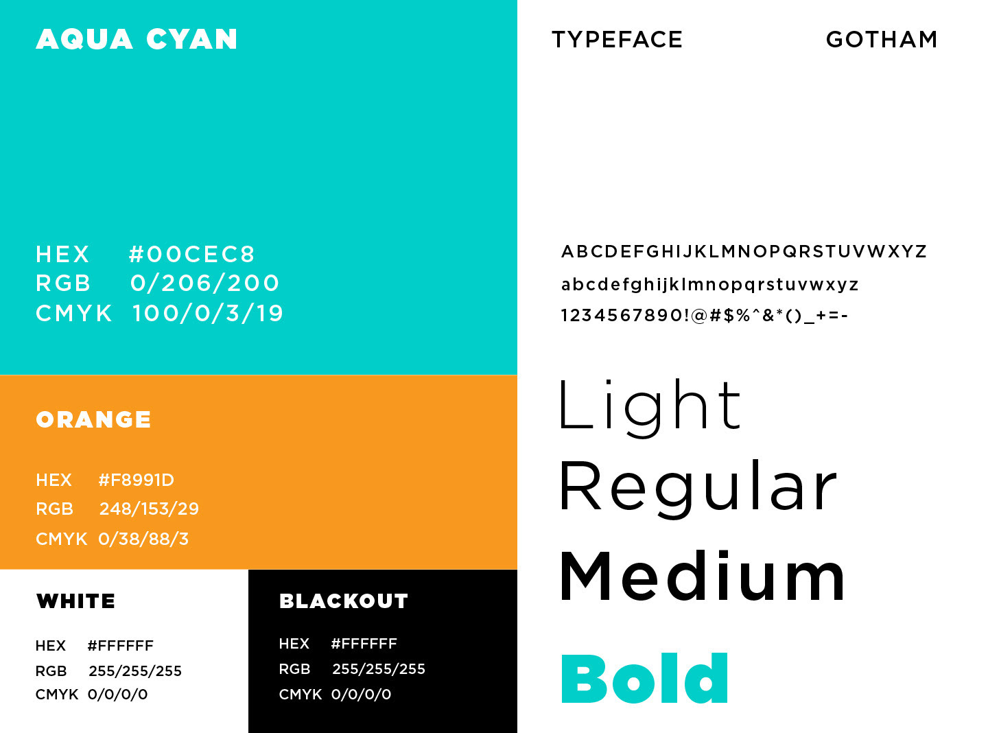
Throughout development I encountered several obstacles that strengthened the final design. Early versions were overcomplicated, with too many details crowding the mark; simplifying it while preserving meaning became a key learning moment. Achieving balance and symmetry between the fingerprint curves and circuit lines required many adjustments to keep both sides visually connected. Color testing also posed difficulty some palettes looked too cold and corporate, others too playful. Through feedback and experimentation, I learned to prioritize clarity and purpose over decoration, which ultimately produced a more confident, focused logo.
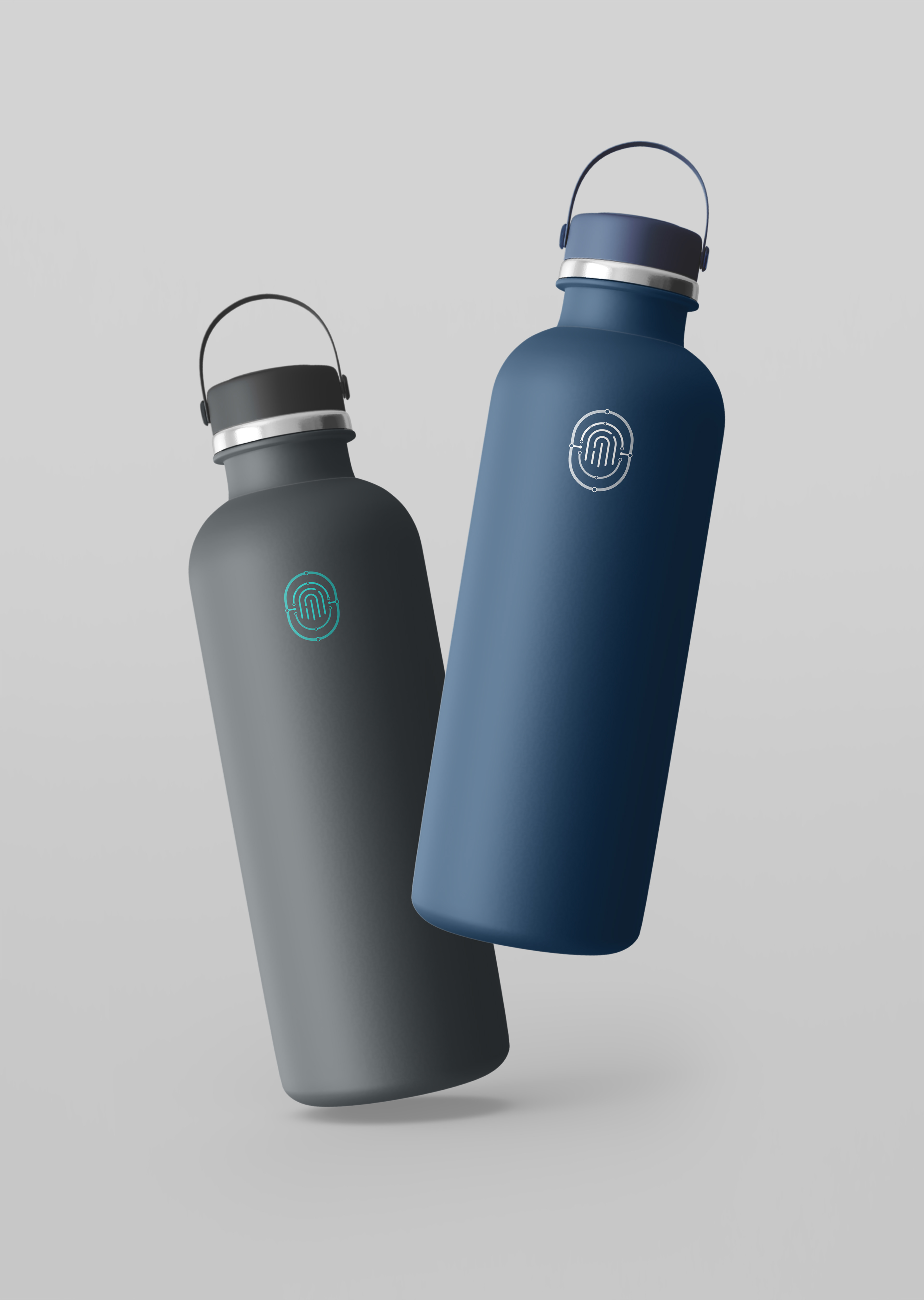
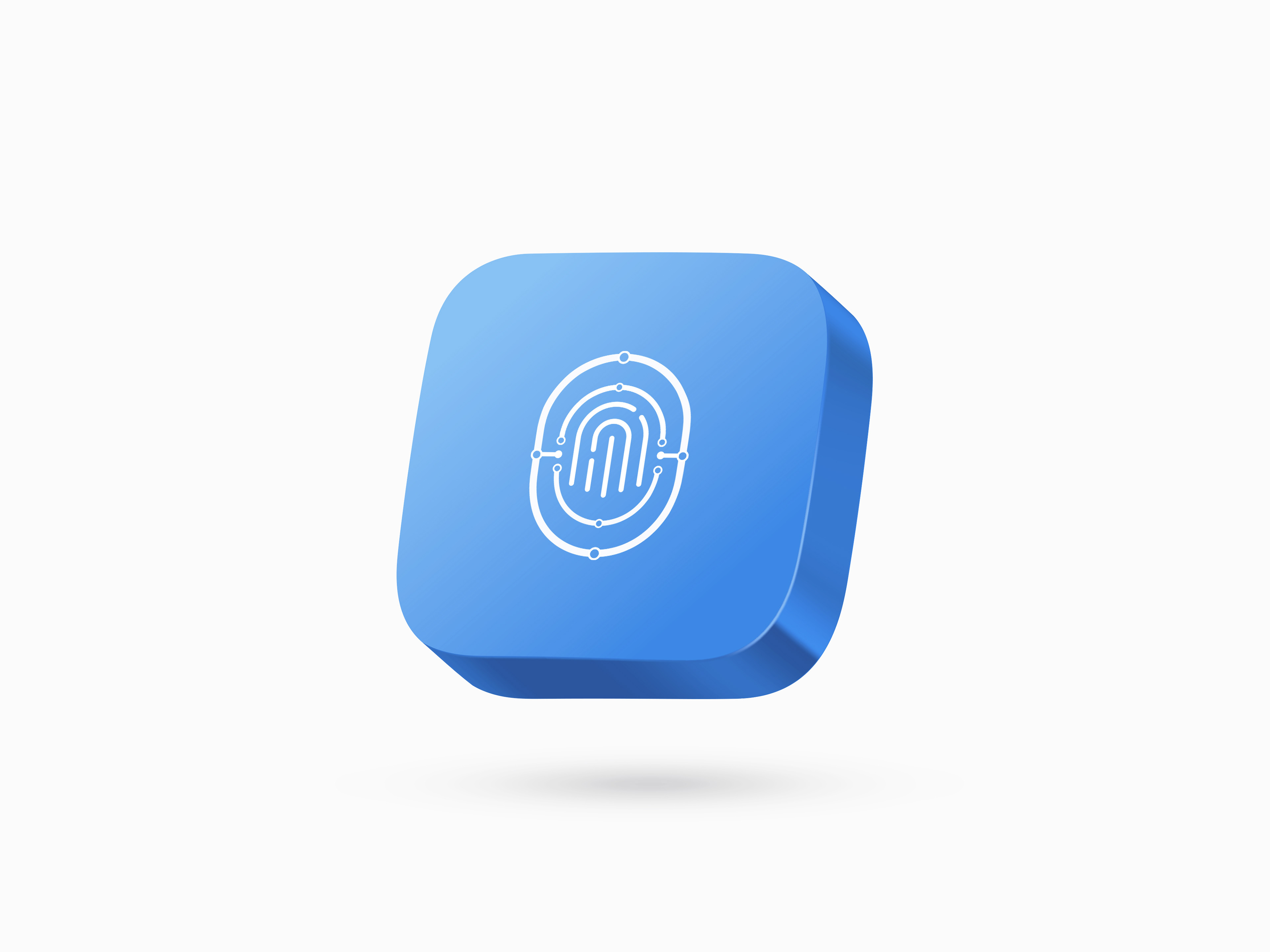
Brand Applications
Cipher Link’s identity extends across digital interfaces, stationery, and product visuals. Clean grids, generous whitespace, and disciplined color ratios maintain a cohesive appearance. Whether on a website, mobile dashboard, or printed report, the logo retains its clarity and authority, strengthening brand recognition.
Final Thoughts
This project taught me how clarity, balance, and symbolism work together to create trust in visual design